Designing london24racing.com
London24racing.com is a website I recently designed for a client, who wanted a website for their motorsport powerboat racing team. The site, which utilises a parallax design of moving background images, is honestly the most professional looking website I have created to date, and I hope to use what I’ve learned in this project dealing with web design in mainly CSS, especially when it comes to responsive web design, to aid me in future projects. The client was very happy with the design, and we plan to expand the functionality of the site to include a blog and photo gallery section in the near future.
A Professional Feel
As mentioned above, the site is by far the most professional looking and feeling website I have created. I did not use a template at all when building it, I got the idea to use a parallax design from this Youtube video, and then built upon the basic design. From there, I modified the site to include a top navigation bar, a side section that contained links to various social media accounts as well as a link to the client’s email, and a footer that contained my name and the names of some of the photographers who were featured on the site.
All of the content for the site so far is on one single page, and instead of the links at the top jumping to different webpages they simply jump to different sections of the single page. This helps create a more fluid experience for the user, as there is no need to go and request a new page from the server each time the user wants to see a different section of the site (as everything is loaded when the first and only page is loaded).
This also makes the site much easier to maintain and manage, as there is only one HTML file that needs to be worried about. Whilst we do plan on adding new pages to the site in the future, this will remain the main front page, as it provides all the information that many of the sites visitors will need or be looking for.
Animations
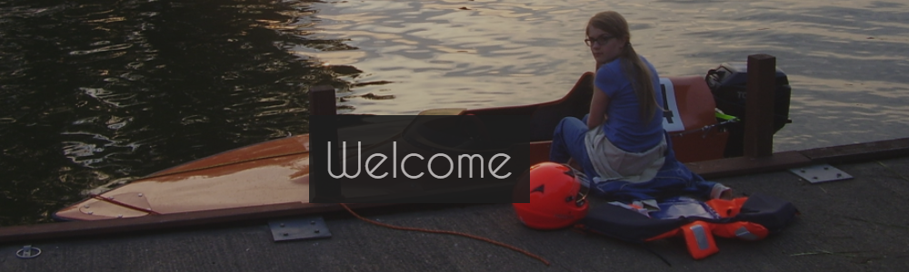
Some elements of the site have animations to them. For example, the social media buttons fade in from the side when the site is first loaded, as well as the text on the top navigation bar fading in from the top of the screen. These animations where accomplished using a library for CSS called animate.css, which you can check out here. This allowed me to create the animations that appear when you first load the page, such as the fade ins mentioned before and the fade in on the headings that appear over the main image. This affect is mostly visible on the “Welcome” at the top of the page.
Although much more complex animations can be done using jQuery and JavaScript, that allow you to choose when certain animations play on the page, I haven’t delved too deep into this yet. I do however plan on eventually having the headings fade in as you scroll down the page, which should look really cool!
Another animation that was used was the scrolling animation, which used jQuery to jump to the specific part of the page with a scrolling effect. This took me a while to get working but I eventually got it, which makes clicking on the top links much more appealing that if it just instantly jumped to the section of the page.
The final animations that I used would be the changing of the social media buttons when they are hovered over, and the increased size of an image in the photography section when they’re hovered over. Both of these effects used basic CSS with the ‘:hover’ selector and CSS transitions to make the jump look nice instead of it instantaneously changing. And with that, I think we’ve just about covered animations! Now onto the big topic: responsive design.
Responsive Design and Mobile Viewing
In the past when I had made websites, which in all honesty hadn’t looked the best even on a desktop, I had the issue of them being viewed on a mobile device. The way I got around this before wasn’t really a solution, as all I did was make sure to set a minimum width of the page so that a user with a small screen would have to scroll around the page. In 2017, where mobile devices are everywhere and a massive chunk of internet traffic comes from devices with small screens, this was far from ideal.
The first tool I learned to use to implement responsive design was CSS media queries. These allowed me to set different CSS rules based up the size of the screen, and as such I was able to implement a basic responsive design that scaled and didn’t require the user to scroll everywhere. However, because of how the site was designed, with each section having two pieces of content, on floating to each side (i.e. in the first section on the left there is the text and on the right there is the photo).
How I solved this was actually quite simple. I created two CSS classes, right and left. Right floated to the right and had a width of 50%, and left floated left and had a width of 50%. Then, using the media query, I set it so if the user had a small screen then both content in the left and right class would not float in any particular direction and have a width of 100%.
Put it simply, if the user had a wide screen, each “section” of content (which would either be text, an image or collection of images ect.) would take up half of the space, meaning two “sections” would sit side by side. However, if the user had a small screen (i.e. they are on mobile) then each “section” would take up 100%, meaning that it would display all in one column. Here is a diagram I made to try and explain this:
HOW IT ENDED UP LOOKING, PRETTY GOOD IF YOU ASK ME!
One other change I made for them mobile version is the contact section. As the social media links where getting in the way of the user seeing the content on small screens, I removed the buttons from the side and added new ones at the bottom of the page in the contact section. This ended up actually looking really nice, and I’m pretty pleased with the result!
Conclusion and The Future
To conclude, this project has honestly been really fun, and I feel like I have produced a quality piece of work from it. The stuff I have learned about responsive design will help me in the future, and I now feel much more confident to produce higher quality and much better looking and feeling websites than I have in the past.
As for the future of the site, we plan on adding a blog as well as a photo gallery that a user can modify and edit using a backend CMS. Whilst this will be a challenge, I think I’m up for the task as I can take much of what I learned from making this site and apply it to that one. It’s nothing that I can’t handle. Hopefully.
Thanks for taking the time to read this (if you have bothered to) and I hope that at the very least it was informative if not interesting!
~ James